UI/UX Design & prototyping!
We design custom, conversion-focused user interfaces and user flows in Figma. Tailored color tokens, responsive wireframes, and developer-friendly design systems.
Mockups & Brand
Bespoke Visual Layouts
Why Custom Prototyping beats out generic templates!
Generic templates are built for everyone, meaning they are built for no one. They force your unique product narrative and branding into boxes that don't match your user journey. This causes confusion, dilutes your authority, and lowers your conversions.
By mapping your user journeys in Figma beforehand, we create custom, clean layouts tailored to your exact conversion paths. This guarantees a seamless user experience, establishes high-end brand authority, and provides developers with precise styling guidelines.
Sectors We Program Custom Interfaces for!
SaaS & Tech Products
Complex application dashboards, visual data graphs, and multi-tenant layout systems.
Consumer Brands
Editorial visual styles, hover animations, storytelling structures, and bold heroes.
Corporate Institutions
ADA-accessible typography scales, executive layout structures, and clean color blocks.
E-Commerce Stores
Optimized product category filters, layout spacing, checkout details, and floating widgets.
Mobile Web Applications
Thumb-friendly mobile navigation rails, touch indicators, and bottom sheet designs.
Tailored Interface Features Built for Digital authority!
Figma Interactive Mockups
Detailed, clickable layout flow blueprints that let you verify the user path before writing code.
Custom Design Tokens
Establishing strict typography rules, custom color variables, borders, and dark/light values.
Brand Identity Audits
Ensuring every button, input box, and layout element reflects your brand's unique character.
Interactive Revisions
Collaborate directly on mockup revisions to verify layouts and styling rules instantly.
Accessibility (WCAG) Check
Optimizing text contrast ratios, input labels, and sizing to meet global usability laws.
Conversion Spacing
Strategic button placements and whitespace sizing that naturally guide the buyer's focus to key CTAs.
Why Visual Hierarchy Dictates Conversions
Users scan screens in F or Z patterns. If your key value statement or CTA buttons are hidden behind cluttered images or misplaced columns, visitors leave. We design screen layouts utilizing precise whitespace, font weights, and contrast priorities to lead the eye to your conversion goals.
Proper visual hierarchy guarantees logical heading trees (H1, H2, H3), which helps crawlers read your pages.
Websites with structured, readable layouts experience up to 40% higher page engagement rates.
Clean Developer-Ready Figma Deliverables
Designers who don't understand code create elements that are impossible to program cleanly. We structure our Figma files using Auto-Layout variables, strict component naming, and CSS-aligned tokens, ensuring your coding team (or ours) can program the layout with 100% precision.
Clean design translates directly to lighter HTML structures and faster page loads, improving ranking signals.
Cuts developer setup cycles in half by removing styling guesses and layout ambiguities.
Our UI/UX Prototyping workflow!
01. Brand & Mood Audit
Review guidelines, select moodboard references, outline styles, and verify objectives.
02. Wireframing Layouts
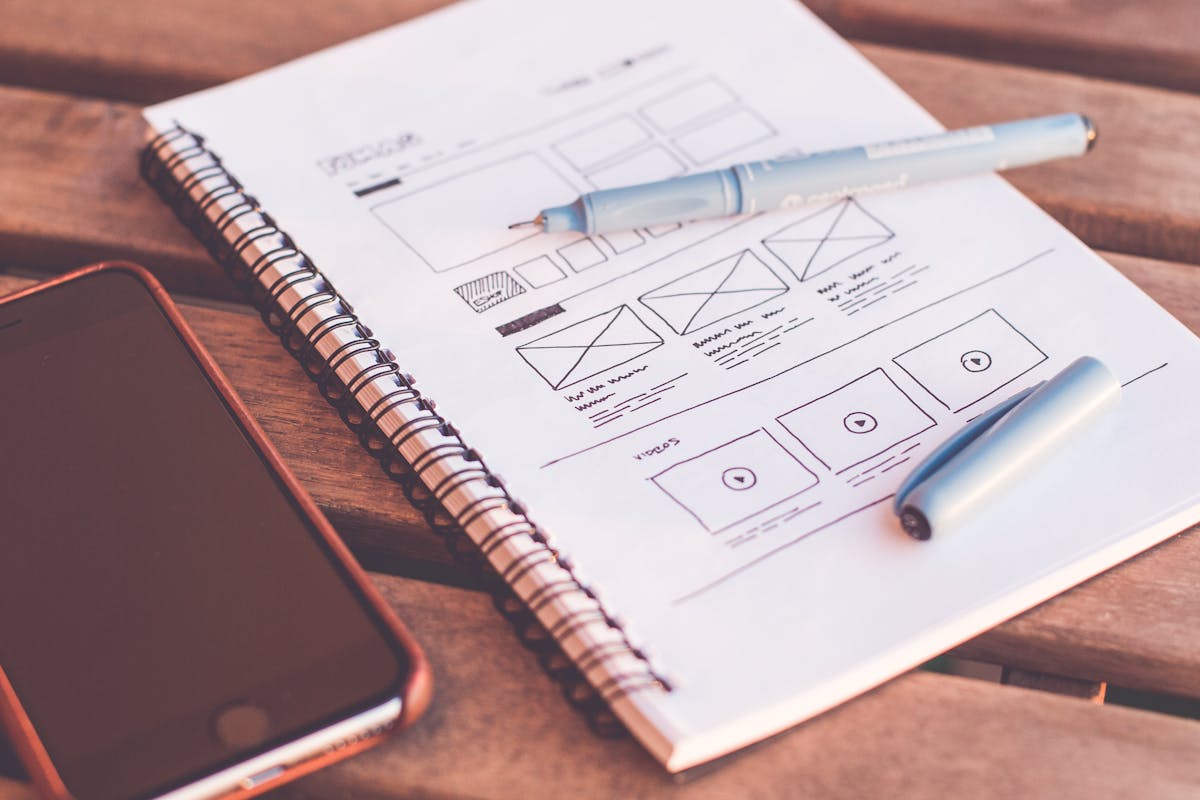
Sketch basic block layouts in low-fidelity frames to establish page flows.
03. High-Fidelity UI Design
Apply colors, typography scales, spacing tokens, and custom graphic blocks.
04. Interactive Prototyping
Connect screen components in Figma to demonstrate clicks, transitions, and slide-ins.
05. Contrast & Mobile Audit
Check contrast ratios, test responsiveness boundaries, and verify mobile layout sizing.
06. Asset Handoff
Package SVG icons, document spacing tokens, and deliver clean layout specs to developers.
UI/UX Design Packages & tiers!
Lander Prototyping
Perfect for companies needing high-converting landing page layouts.
- Custom hero moodboards
- Figma landing page wireframe
- Responsive mobile viewport design
- Color & typography recommendations
- Standard vector icon package
Standard Web Design
Best for corporate sites, startups, and agencies needing a multi-page design.
- Up to 8 custom page layouts
- Full Figma interactive prototype
- Dark & Light viewport renders
- Custom color/spacing tokens sheet
- Accessibility validation check
- Developer handover walk
Product UI & Brand System
Tailored for SaaS products, complex applications, and brands seeking ultimate styling guides.
- Unlimited page wireframes
- Custom reusable component library
- Comprehensive brand identity guidelines
- Advanced interactions & page transitions design
- 3 design revision cycles
- Weekly feedback syncs
UI/UX Design FAQ!
What design software do you use?
We design all wireframes, visual systems, and interactive prototypes inside Figma. It allows real-time collaboration, interactive prototyping, and seamless developer exports.
How many design revisions do we get?
Depending on your selected package, we include between 2 to 3 structured revision cycles. This lets you review layouts, adjust spacing, modify colors, and fine-tune elements before files are finalized.
Do you write the website code as well?
Yes. While this service is dedicated to UI/UX design, our core agency specializes in web development. We can transition your Figma prototypes into custom Next.js codebases seamlessly.
What is a 'Design System' and why do we need it?
A design system is a central library containing your typography scales, color variables, borders, buttons, form fields, and spacing rules. It ensures your branding remains consistent across different pages and future builds.
Do you support dark mode design?
Yes. We design layouts specifically for both light and dark backgrounds, defining color shifting tokens to ensure text remains readable and layouts look premium in both modes.
How do you check for accessibility compliance (WCAG)?
We use Figma analyzer plugins to check that text contrast ratios meet WCAG AA standards and ensure buttons and interactive fields have touch target dimensions suitable for mobile users.
Do we get ownership of the Figma source files?
Yes. Upon completing the project and resolving final balances, we transfer full ownership of the Figma source files, color guides, and asset packages to your team.
What deliverables do I receive at handoff?
You receive the master Figma file containing clickable prototypes, mobile/desktop viewports, customized design systems, and export-ready assets (SVG/PNG).
How long does the UI/UX design process take?
A standard web design project takes between 2 to 5 weeks depending on the number of screens, visual assets, and custom components required.
How do you align design with conversion goals?
We structure pages based on visual priorities, placing value statements and primary CTAs at high-focus spots while structuring layouts to reduce user confusion.
Ready to Build a Website That Drives Growth?
Whether you're launching a new business or redesigning an existing site, we'll build a website that looks exceptional, performs flawlessly, and delivers results.
WhatsApp Us